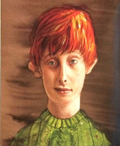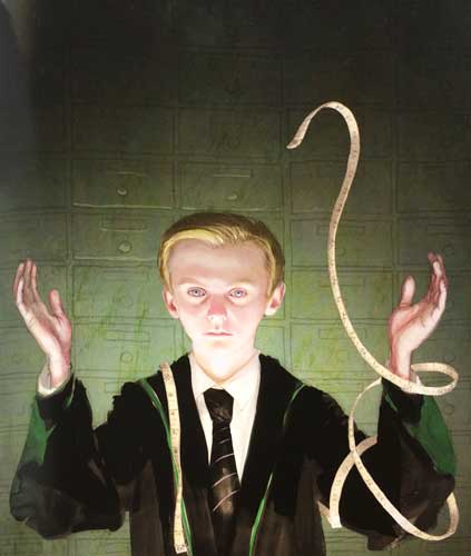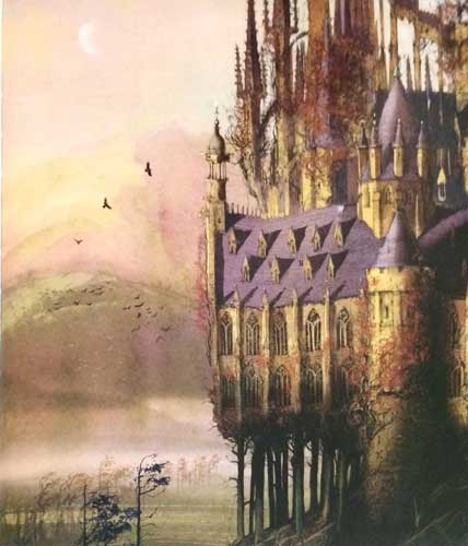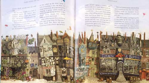
October 6, 2015 was the day that the very first fully illustrated Harry Potter book, Harry Potter and the Sorcerer's Stone, was published. Artist Jim Kay had the honor of bringing Harry's world to life in over 100 gorgeous color illustrations in this new edition.
To say that this book is beautifully done is an understatement. Jim Kay clearly understands this story because he included details, both large and small, to his illustrations that fans of all ages will delight in. For example, the opening page of the book, the one that gives the book's title, has the image of a toad. People who haven't read the book would have no idea why there is a toad on this page, but we fans know that the toad has to be Trevor.
Not every page has an illustration, but every page has something, even if it is nothing more than smudge marks or background colors. Some illustrations are small, some take up an entire page, and others fill up two pages. All are gorgeous!
The one thing that surprised me was how large the book is. It is much bigger than I expected it to be, and this is a good thing because it means the images are large and easy to explore. Also, the paper chosen for this edition is very thick and feels nice to the touch.
I highly recommend this book to anyone who loves these stories, even if you already have this book in another format. It is an edition that will be loved and enjoyed for years to come.
Video Of Me Unboxing This Book
I preordered this book and was really excited the day it arrived at my home. Take a look at the video below as I finally get to see what this book looks like.
Images From The Book
Below are several pictures that I took of artist Jim Kay's illustrations so you can get a better idea of what to expect. Keep in mind that there are well over 100 graphics. What you see below is just a small sampling of the book's images. Even the pages that don't have pictures are marked with ink spots or other subtle (or not so subtle) decorations.

Dust jacket cover illustrations
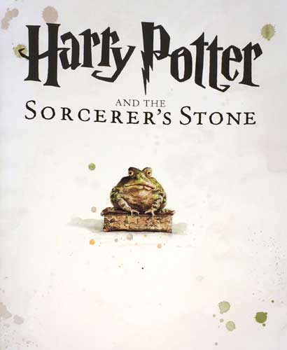
This is the first page of the book
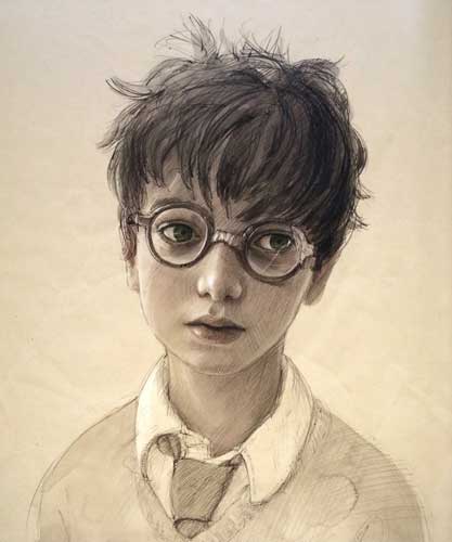
Harry Potter
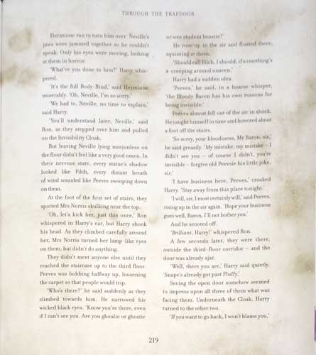
Example of a page with smudges and stains
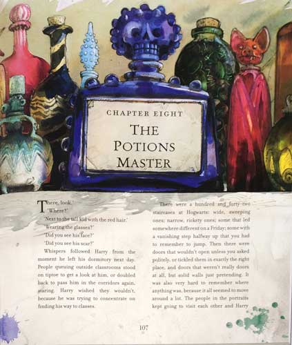
Example of illustrations on a chapter page
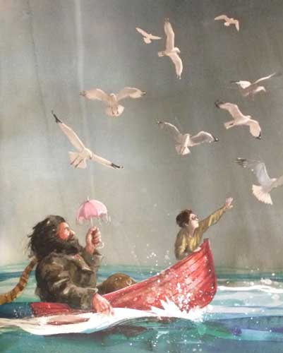
Hagrid and Harry

Harry and Dumbledore talking about the Mirror of Erised
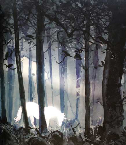
A unicorn in the Forbidden Forest


